ReactTypeScriptWebGLGLSLView TransitionsIntl
Керування
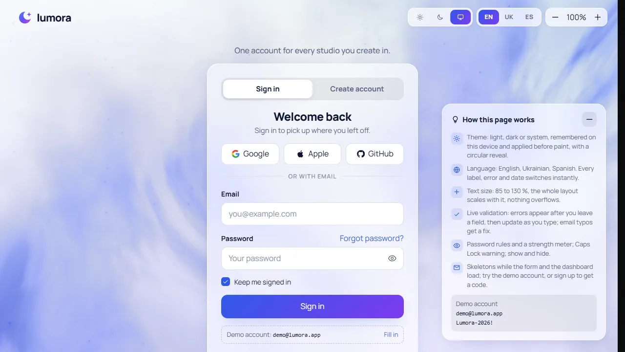
- Sun, moon and screen buttons pick the light, dark or system theme
- EN, UK and ES switch the language of every label, error and date
- Minus and plus change the text size from 85 to 130 percent; the percentage resets it
- Sign in with [email protected] and Lumora-2026!, or press Fill in; three wrong passwords lock the form for 30 seconds
- Create account shows live rules and a strength meter, then a 6-digit code arrives in a demo toast; typing or pasting it verifies
- The hints panel in the bottom right folds away with the minus button and comes back with Show hints
- Move the pointer to tilt the nebula; it surges forward while a form is sent
Works in every modern browser. The nebula sky needs WebGL; without it a CSS sky with the same colours stays. The circular theme reveal needs the View Transitions API and is an instant switch elsewhere. Respects the reduced-motion setting: a still nebula, no shimmer, shake or reveal. A fictional brand: nothing is sent or stored except the theme, language and text size in this browser.
Як це зроблено
A sign-in and sign-up flow for Lumora, a fictional creator platform, built as product UI: plain React, CSS and raw WebGL, no UI kit and no engine.
- Sky: a CSS daytime sky (deep navy in dark) and a soft underpainting in the brand colours paint from the first frame; a plain WebGL nebula then fades in over 2.5 s and the underpainting fades out. The costly gas field (6-octave noise from one tiling noise texture, a diagonal band with dust lanes, calmer behind the card) renders into offscreen keyframes every 0.4 s, one strip per frame; each display frame only blends the two newest keyframes, adds pointer parallax and twinkling stars, and zooms in briefly while a form is sent. Without a GPU, or under reduced motion, it draws one still frame. It pauses in a hidden tab.
- Theme: three icon buttons for light, dark or system, stored in this browser. System follows
prefers-color-scheme live through useSyncExternalStore. A change runs inside document.startViewTransition, and only the example gets a transition name for that moment, so the new theme grows as a circle from the button. Without the API, or under reduced motion, it switches instantly. - Type: Plus Jakarta Sans, with Inter filling the Cyrillic it lacks (the air.io pairing), both from
next/font inside this chunk. - Language: every visit opens in English; Ukrainian and Spanish come from one typed dictionary (the English object is the key list, so a missing translation fails the type check). Numbers, dates and "2 hours ago" use
Intl.NumberFormat, DateTimeFormat and RelativeTimeFormat for the chosen locale. The lang attribute follows the choice. - Text size: every size in the stylesheet is in
em off one --z variable, so 85 to 130 percent scales the whole layout, not just the type. - Validation: errors appear when you leave a field, then update as you type. A failed submit shakes the card and moves focus to the first invalid field. Inputs carry
aria-invalid and aria-describedby. Email typos are matched against common domains by edit distance ("gmial.com" offers "gmail.com"). Passwords show five live rules and a four-step strength meter, with a Caps Lock warning and show/hide. - States: a skeleton form while the page settles, busy buttons with spinners, a lockout with a countdown after three wrong passwords, a reset-link screen, a 6-digit code step (auto-advance, paste and backspace across boxes, auto-verify) and a dashboard that shows a skeleton before its numbers stagger in.
- The rules live in
validate.ts and the copy in i18n.ts, both pure and unit-tested. The "back end" is one demo account in memory, and nothing leaves the page.