Dark mode: color-scheme and no flash
How color-scheme and prefers-color-scheme work, how to avoid the flash of the wrong theme, and how this blog's own light and dark switch is built.
· 4 min read
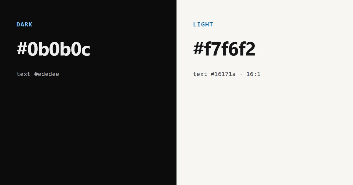
A dark mode needs three things: a stylesheet that changes colours, a color-scheme declaration so the browser's own controls match, and a way to apply the chosen theme before the first paint so the page does not flash the wrong one. In my experience, most of the bugs are in the second and third.
This post follows web.dev's article on color-scheme, which dates from 2020, and then shows how the blog and the tools on this site do it, including the parts where I differ from the advice.
color-scheme and prefers-color-scheme#
They do different jobs, and web.dev says to combine them.
color-schemeopts a page in to the theme-specific defaults of the browser's stylesheet. It acceptsnormalor an ordered list such asdark light. It changes things you did not style: scroll bars, spellcheck underlines and form controls, and, when set on:root, the surface colour of the canvas and the system colours.prefers-color-schemeis a media query for the visitor's system setting, and it is what you use to write your own colours.
:root {
  color-scheme: dark light;
}
@media (prefers-color-scheme: dark) {
  :root {
    --bg: #0b0b0c;
    --fg: #ededee;
  }
}
You can also declare the scheme in the markup, which the article recommends:
<meta name="color-scheme" content="dark light" />The reason is timing. Honouring the CSS property requires the CSS to be downloaded first, while the meta tag lets the browser paint the background in the chosen scheme right away.
The article also says to always combine color-scheme with prefers-color-scheme, because some defaults are not accessible on the other theme. Its example is the default link blue, which has a contrast ratio of 2.23 to 1 on a black background.
The flash of the wrong theme#
If the theme is stored in JavaScript and applied after the page loads, a visitor who chose the other theme sees the default one first. The fix is a tiny inline script that runs while the HTML streams in, before the first paint, and sets the theme on an element.
How this blog does it#
The blog and the tools sit inside a wrapper element. The default is dark, and a light "paper" palette applies when the wrapper has data-theme="light". A small inline script sits inside that wrapper and runs before the content is painted:
try {
  if (localStorage.getItem("content-theme") === "light") {
    document.currentScript.parentElement.setAttribute("data-theme", "light");
  }
} catch (e) {}
It reads the stored choice and sets the attribute on the wrapper it is in. That works on a full page load. When a reader arrives from another page of the site, React renders the wrapper in the browser and inline scripts do not run, and React logs a console error if you try to render one there. I found this when the error appeared and the saved light theme was lost on in-site navigation. The fix is a layout effect that applies the stored choice on mount, and the script is only rendered in the server HTML and during hydration. The try is there because storage can throw in private modes. The button at the bottom left of this page flips the attribute, saves the choice in localStorage and tells the rest of the page. The choice stays on this device only.
The palette is a set of CSS variables that the light scope re-points, so every rule that uses them follows. Three details:
- The scope sets
color-scheme: light, so native controls and scroll bars match. - Code blocks stay dark in both themes, because the syntax highlighter's colours are made for a dark background.
- The site's header and footer stay dark, since they are outside the wrapper.
The light palette comes with contrast figures in the stylesheet, measured against the background #f7f6f2: body text #16171a at 16.6 to 1, muted text #4a4d55 at 7.8 to 1, subtle text #5c606a at 5.8 to 1 and the accent #0a62a8 at 5.8 to 1. All pass the WCAG AA ratio of 4.5 to 1 for normal text.
Where I differ from the advice#
- No
prefers-color-scheme. The page starts dark for everyone and switches only when the visitor presses the button. It does not follow the system setting. web.dev's advice is to combine the two, and a visitor with a light system theme gets a dark page until they switch. The dark default matches the rest of the site. Adding the media query would be the next step. - The light choice exists only as CSS. The page's meta tag and
:rootboth saydark, and the light paper comes from CSS on the wrapper, so a meta tag cannot help it. The light background appears once the stylesheet applies. I have not measured whether a reader ever sees dark first. - The switch is not announced as a state. The button's label says "Switch to light theme" or "Switch to dark theme", which names the action. I have not tested it with a screen reader.
A checklist#
- Declare
color-schemein CSS and in a meta tag. - Write your colours twice: for the default and for
prefers-color-scheme. - If you offer a manual switch, store the choice and apply it with an inline script before paint.
- Check contrast in both themes, not only the one you designed first. The default blue of links is the usual failure.
- Keep code blocks and images in mind. Pictures with a white background look wrong on a dark page.
Limits of this post#
web.dev's article is from April 2020 and does not cover newer features such as the light-dark() function. I did not test the theme switch with assistive technology, and the contrast figures were recomputed with the WCAG formula.