CSS on scroll: scroll-driven animations
How scroll() and view() timelines work, a reading progress bar in a few lines of CSS, animation-range names, browser support and the reduced-motion guard.
· Updated · 4 min read
CSS scroll-driven animations tie an ordinary CSS animation to scroll position instead of time. You write the keyframes as usual, then set animation-timeline to scroll() or view(), and the browser plays the animation as the page scrolls. No scroll listener and no JavaScript are needed, and it can run off the main thread.
This post explains the two timelines, shows the reading progress bar at the top of this blog, and lists what to check before you ship it. The code and the support list come from Chrome's guide and MDN's module overview.
The two timelines#
- A scroll progress timeline is linked to the scroll position of a scroll container along an axis. In CSS you set it with
scroll(). The animation goes from 0 to 100% as the container scrolls from the start to the end. - A view progress timeline is linked to the position of an element inside its scroll container. In CSS you set it with
view(). The animation runs as the element enters, crosses and leaves the visible area.
MDN states the idea in one sentence: it lets you animate property values along a scroll-based timeline rather than the default time-based document timeline.
A progress bar#
This is adapted from the pattern in Chrome's guide, a fixed bar that grows as the page scrolls:
@keyframes grow-progress {
  from {
    transform: scaleX(0);
  }
  to {
    transform: scaleX(1);
  }
}

#progress {
  position: fixed;
  inset: 0 0 auto 0;
  height: 2px;
  transform-origin: 0 50%;
  animation: grow-progress auto linear;
  animation-timeline: scroll();
}
The guide notes that animation-duration should be auto for this timeline, and it animates transform instead of width so the work can be composited.
The bar on this blog#
The bar at the top of this page is the same idea, with two guards around it (trimmed here to the parts that matter):
.blog-progress {
  display: none;
}
@supports (animation-timeline: scroll()) {
  @media (prefers-reduced-motion: no-preference) {
    .blog-progress {
      display: block;
      position: fixed;
      inset: 0 0 auto 0;
      height: 2px;
      transform-origin: 0 50%;
      scale: 0 1;
      animation: blog-progress linear both;
      animation-timeline: scroll(root block);
    }
  }
}
@keyframes blog-progress {
  to {
    scale: 1 1;
  }
}
@supports (animation-timeline: scroll())means a browser without the feature never shows the bar. It is a nicety, so there is nothing to polyfill.@media (prefers-reduced-motion: no-preference)keeps it away from visitors who asked for less motion.scroll(root block)picks the page's own scroll container and the block axis, which is vertical for English text.
I did this in CSS because the effect is decorative and has no state. There is no JavaScript on this page for it.
Reveal on view#
A view timeline is what you want for "fade in as it scrolls into view". This is the example from Chrome's guide:
@keyframes reveal {
  from {
    opacity: 0;
  }
  to {
    opacity: 1;
  }
}

img {
  animation: reveal linear;
  animation-timeline: view();
}
By default the animation spans the whole time the element is in view. You can narrow it with animation-range. The guide lists these range names:
| Name | Covers |
|---|---|
cover | The full range, from first intersection to fully leaving the scrollport |
entry | While the element enters the visibility range |
exit | While the element exits |
contain | While the element is fully inside, or fully covering, the scrollport |
entry-crossing, exit-crossing | While the element crosses the end or start border edge |
Each range takes an offset. The guide's example is animation-range: entry 25% cover 50%;.
Why it is cheap#
The guide explains the problem with the old approach: modern browsers scroll on a separate process and deliver scroll events asynchronously, so a scroll listener struggles to stay in sync. Scroll-driven animations let the browser drive the animation itself, and the guide says they can run off the main thread. Stick to transform and opacity, as the progress bar does, so that is true in practice.
Browser support#
The Chrome guide lists Chrome 115, Edge 115 and Safari 26. It marks Firefox as a Technology Preview, which may be out of date, so check Can I Use before you rely on it. When the guide was written in 2023, the timeline-scope feature, which lets a timeline be used by a non-ancestor element, was not yet supported in Chrome 115. Check Can I Use for its current status.
Treat it as progressive enhancement: wrap it in @supports, and make sure the page works when nothing animates.
When it is not the right tool#
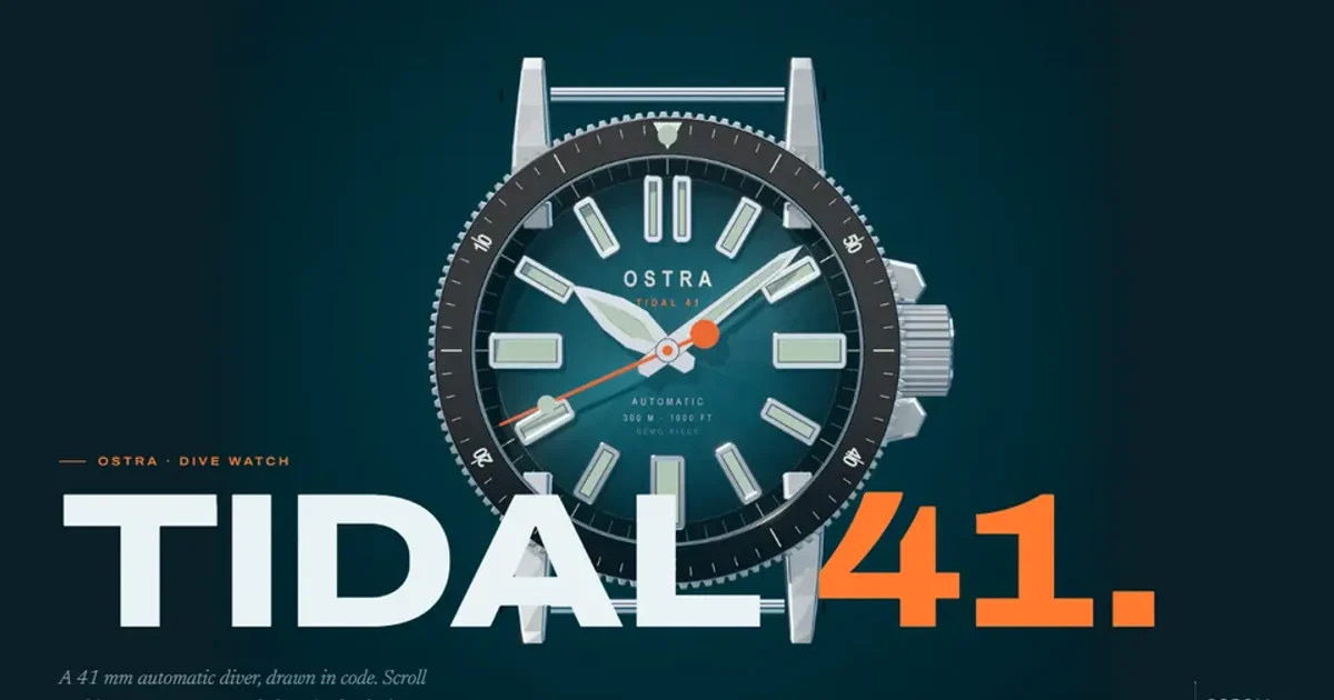
CSS timelines are good for simple, state-free effects. I still use JavaScript when the animation needs logic. The Ostra Tidal 41 page draws one of hundreds of frames to a canvas depending on scroll position, with downloads and memory managed in code, as I describe in Scroll image sequences on a budget. A smooth-scroll library is a separate question, covered in Lenis and reduced motion: four gotchas.
For how long a scroll-linked animation should last, see How long should a UI animation take?. A scroll-linked animation has no duration of its own, so the length is the distance the visitor scrolls.
Limits of this guide#
I read the Chrome guide and the first part of the MDN page, and I did not read the MDN pages on the individual functions and ranges in full. I have not tested the progress bar in Firefox, so the Firefox status comes from the Chrome guide only.