img srcset and sizes: responsive images
How srcset, sizes and picture let the browser pick the right image file, with MDN's rules and a size test showing what one 1200 px cover costs a phone.
· Updated · 5 min read
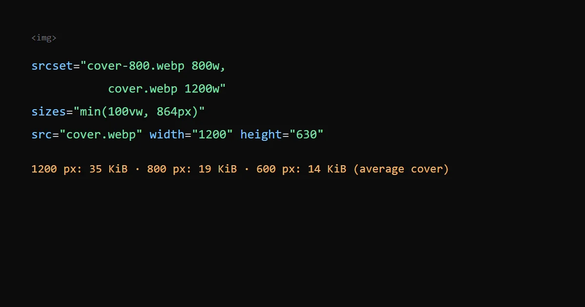
srcset lists several versions of an image and sizes tells the browser how wide the image will be on the page, so the browser can download the smallest file that still looks sharp. Use it for any image that is shown at very different widths on a phone and on a desktop. For an image shown at one fixed size, a simpler srcset with 1x and 2x descriptors is enough.
This guide follows MDN's responsive images guide. I also measured what the single cover image of each post on this blog costs a phone, and I describe that near the end.
Resolution switching: srcset with sizes#
srcset lists the candidate files with their widths. MDN says it "defines the set of images we will allow the browser to choose between, and what size each image is". The width uses the w unit, which is the intrinsic width of the file in pixels and not CSS pixels.
sizes says how wide the image will be in the layout. It lists media conditions with a slot width each, and it indicates what image size would be best to choose when a condition is true.
<img
  srcset="elva-fairy-480w.jpg 480w, elva-fairy-800w.jpg 800w"
  sizes="(width <= 600px) 480px, 800px"
  src="elva-fairy-800w.jpg"
  alt="Elva dressed as a fairy"
/>
MDN lists the rules for sizes:
- A slot width can be absolute, such as
480px, or relative to the viewport, such as50vw. You cannot use a percentage. - The browser ignores everything after the first matching condition, so order the conditions with care.
The browser's choice follows four steps. It considers the screen size, pixel density, zoom, orientation and network speed. It finds the first media condition in sizes that is true and reads the slot size. Then it loads the srcset file that matches. If there is no exact match, MDN says it picks the first image that is bigger than the slot and scales it down.
Resolution switching with x descriptors#
If an image is always shown at the same CSS size, skip sizes and describe the pixel density instead:
<img
  srcset="elva-fairy-320w.jpg, elva-fairy-480w.jpg 1.5x, elva-fairy-640w.jpg 2x"
  src="elva-fairy-640w.jpg"
  alt="Elva dressed as a fairy"
/>
MDN's example sets img { width: 320px }. A normal screen then takes the 320 file and a screen with two device pixels per CSS pixel takes the 640 file. MDN calls this "a somewhat easier syntax".
Art direction with picture#
When different layouts need different crops, not just different sizes, use picture:
<picture>
  <source media="(width < 800px)" srcset="elva-480w-close-portrait.jpg" />
  <source media="(width >= 800px)" srcset="elva-800w.jpg" />
  <img src="elva-800w.jpg" alt="Chris standing up holding his daughter Elva" />
</picture>
Two rules from MDN: you must put an img with src and alt right before </picture>, or no image will appear. And use the media attribute only for art direction. When you use it, do not also offer media conditions within sizes.
The same picture element also serves formats. I covered that in AVIF, WebP or JPEG: which to serve.
Why not CSS or JavaScript#
MDN explains that the browser preloads images before its parser has processed the page's CSS and JavaScript. If a script measures the viewport and then swaps the image, the large original has already been downloaded, and the small one is downloaded as well. Use the attributes, not scripts.
Always keep width and height#
srcset does not replace width and height. They let the browser reserve space before the file arrives, which prevents layout shift, as I describe in Cumulative Layout Shift (CLS): fixes. Give them the intrinsic size of the default src.
What one fixed size costs: a test on this blog#
Every post here has one cover of 1200 × 630 pixels. On a 412 pixel wide phone, the size Lighthouse uses, the cover is shown about 368 CSS pixels wide, which is about 736 device pixels on a 2x screen. A Lighthouse report on the Playable ad specs post listed image delivery as a place to save about 45 KiB. I did not check which images it counted.
To see how much a smaller file would save, I resized the 30 covers published before this post with the sharp library, from the WebP files that are already published, at quality 84:
| Width | Total for 30 covers | Average per cover |
|---|---|---|
| 1200 px (as published) | 1,052 KiB | 35 KiB |
| 800 px | 561 KiB | 19 KiB |
| 600 px | 410 KiB | 14 KiB |
An 800 pixel file would be about 16 KiB smaller on average, and it would still cover the phone's 736 device pixels. The numbers have limits. The 1200 files are the originals, while the smaller ones are re-encoded from them, so their quality differs. And the desktop layout shows the cover up to about 864 CSS pixels wide, which on a 2x screen needs more than 800 pixels. A pair such as cover-800.webp 800w and cover.webp 1200w with sizes="min(100vw, 864px)" would serve both.
I have not made that change. The measurement is a lab estimate, and it would add a second file per post.
Where this site does something similar#
The topic tiles on the home page show small thumbnails of Lab examples. They do not use srcset. They use a separate 480 × 300 file instead of the 960 × 600 card. For one example, the small file is 10.6 KiB and the large one 27.9 KiB. That is a fixed choice for a fixed small slot, which works because the tile is always small.
A short checklist#
- Give every content image
width,heightandalt. - For an image that changes size across layouts, use
srcsetwithwdescriptors and a correctsizes. - For a fixed-size image, use
1xand2xdescriptors. - Use
pictureonly for different crops or different formats. - Check the result in the Network panel at a phone width and a desktop width.
To write the srcset and sizes for your own layout and see which file each screen would load, use my srcset & sizes Generator.
If you need a file at a target size, my Compress Image to Size tool finds the best quality that fits, in your browser.
Limits of this post#
I read MDN's guide on 18 October 2026. I did not test the sizes examples in a browser for this post. The size test used one set of 30 images at one quality setting, and a real set of responsive files should be checked by eye.