WCAG color contrast ratio explained
How the WCAG contrast ratio is calculated, why 4.499 fails 4.5:1, what counts as large text and UI parts, and the colour pairs that fail most often.
· Updated · 5 min read
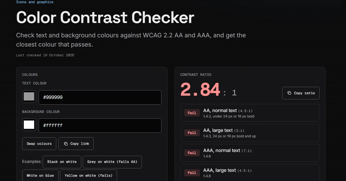
The WCAG contrast ratio compares the brightness of two colours on a scale from 1:1 to 21:1. Level AA asks for at least 4.5:1 for normal text, 3:1 for large text, and 3:1 for icons, input borders and focus indicators.
I built a Color Contrast Checker on this site, and every ratio below comes from its code. The formula is short. The mistakes around it are what cost people the pass.
How the ratio is calculated#
WCAG 2.2 defines the contrast ratio as:
(L1 + 0.05) / (L2 + 0.05)L1 is the relative luminance of the lighter colour and L2 of the darker one. Relative luminance runs from 0 for black to 1 for white. Here is the function from my checker:
const channel = (v: number) => {
  const c = v / 255;
  return c <= 0.04045 ? c / 12.92 : ((c + 0.055) / 1.055) ** 2.4;
};

const luminance = ({ r, g, b }: Rgb) =>
  0.2126 * channel(r) + 0.7152 * channel(g) + 0.0722 * channel(b);
Two things in it matter in practice. The channel step undoes the sRGB gamma, so #808080 is not half as bright as white: its luminance is about 0.22. The weights say green counts for far more than blue, which is why pure blue on white reaches 8.59:1 and pure red only 3.99:1.
If you have seen 0.03928 in older code, that was the threshold until May 2021, when WCAG changed it to 0.04045. For 8-bit colours the result is the same, because no channel value falls between the two.
Why 4.499 does not pass#
The Understanding page for 1.4.3 says the ratios are thresholds and "the computed values should not be rounded (e.g., 4.499:1 would not meet the 4.5:1 threshold)."
So a tool that rounds to one decimal can show 4.5 for a pair that fails. My checker truncates to two decimals instead. The neighbours #767676 and #777777 show how tight it gets on white:
| Text on white | Exact ratio | Shown | AA normal text |
|---|---|---|---|
#767676 | 4.5422 | 4.54 | Pass |
#777777 | 4.4781 | 4.47 | Fail |
One step of grey decides it. #767676 is the lightest neutral grey that passes on white.
Where 4.5:1 comes from#
It is not arbitrary. The same page says 3:1 is the minimum that ISO 9241-3 and ANSI/HFES 100-1988 recommend for standard text. It then multiplies by 1.5 to offset the contrast sensitivity lost at about 20/40 vision, and 3 × 1.5 gives 4.5. The AAA figure of 7:1 follows the same reasoning for about 20/80 vision.
What counts as large text#
Large text is at least 18 point, or 14 point bold. WCAG uses 1 pt = 1.333 CSS px, which makes that roughly 24 px, or 18.5 px bold. It is a size rule, so a 20 px regular heading is still normal text and needs 4.5:1.
| Content | AA | AAA |
|---|---|---|
| Normal text | 4.5:1 | 7:1 |
| Large text | 3:1 | 4.5:1 |
| Icons, input borders, focus (1.4.11) | 3:1 | none |
UI parts and graphics#
Success criterion 1.4.11 asks for 3:1 "against adjacent color(s)", and it has the same no-rounding note, with 2.999:1 as its example. It covers the parts you need to see in order to use a control, including a border when that border is the only thing that identifies an input, and a custom focus indicator. The browser's default focus style is exempt, though it still has to be visible.
Inactive controls are exempt from both criteria. Logotypes and pure decoration are exempt from 1.4.3. Placeholder text is not on that list, and it is the first of the usual failures.
The pairs that usually fail#
I ran these through contrastRatio:
| Pair | Ratio | Result |
|---|---|---|
#999999 on white | 2.84 | Fails everything, including 3:1 |
#808080 on white | 3.94 | Large text and UI only |
#ff0000 on white | 3.99 | Large text and UI only |
#f5c518 on white | 1.63 | Fails everything |
White on #ff7f50 (coral) | 2.49 | Fails everything |
Black on #ff7f50 (coral) | 8.40 | Passes AAA |
#2563eb on white | 5.16 | Passes AA normal text |
The coral row is the one designers argue with. White text feels right on a saturated button, and black is the pair that passes. Orange and coral have high luminance because they carry a lot of green. The mid-grey #808080 makes the same point from the other side: it reaches 5.31:1 on black and 3.94:1 on white.
Other failures I look for:
- Text over images and gradients. One pair of colours does not describe them. Failure F83 covers background images without enough contrast, so test the worst spot. The Image Color Picker reads that spot from a screenshot and shows its ratio with white and black.
- A text colour with no background set. The glossary treats this as a failure, because the user's default background is unknown.
- Opacity on text. The colour on the screen is a blend, so measure the blend. The checker lays an alpha colour over the background first.
- Thin fonts. They render fainter than their colour value says. The Understanding page advises a font with thicker strokes, or going above the minimum.
Passing is not the same as readable#
The formula is a model, and a pair can pass and still be hard to read, especially light text on a dark background. APCA is a proposed alternative that accounts for polarity and text size. It is not part of WCAG 2.2, so it cannot give you a conformance pass. The WCAG 3 working draft of 10 September 2026 says its own contrast algorithm "is yet to be determined", so nothing has replaced the 2.x ratio yet. My OKLCH Converter shows the WCAG ratio and an APCA reading side by side if you want to compare them, but meet the WCAG number first.
If a colour fails, keep the hue and move the lightness. The checker does this for you: #999999 on white becomes #767676. I wrote about another AA rule that is easy to miss in WCAG 2.2 target size.